The Content Library
Basic concepts
Each level hosts its own content library. Content assigned to the topmost group (root level) is deemed to be “global”, meaning this content can be made available to any sub-group below it. Content assigned to the lowest sub-group (this is the level where players are assigned) is considered “local”, meaning this content can only be played in that specific sub-group. This content is not available to other groups unless you duplicate it. If your hierarchy many levels, the higher you upload your content, the more shareable it becomes.
Click here for the Content Library video tutorial.
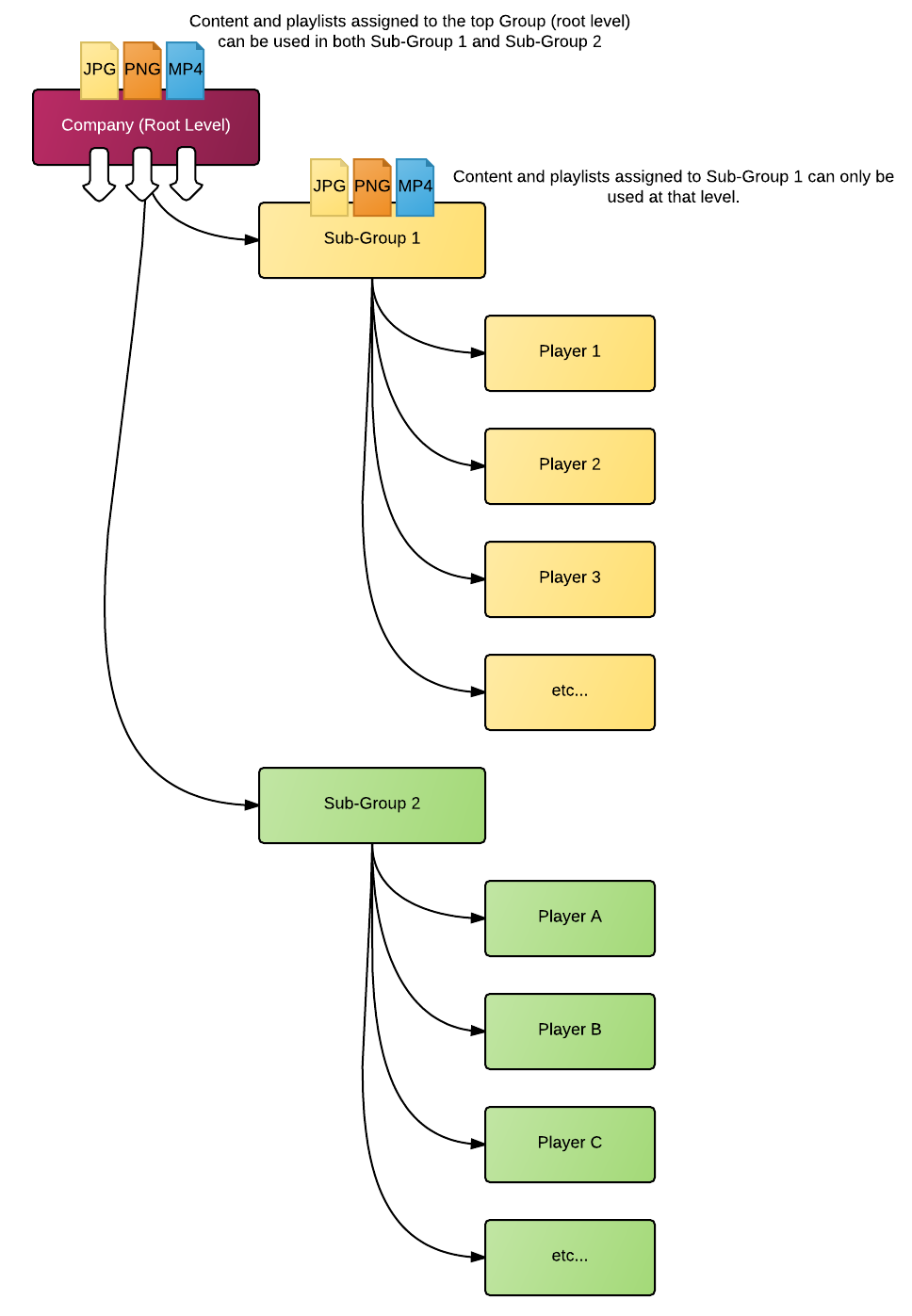
Here is a simple two level hierarchy. Content assigned to the top (root) level is shareable below. Content assigned to a sub-level can only be used locally.
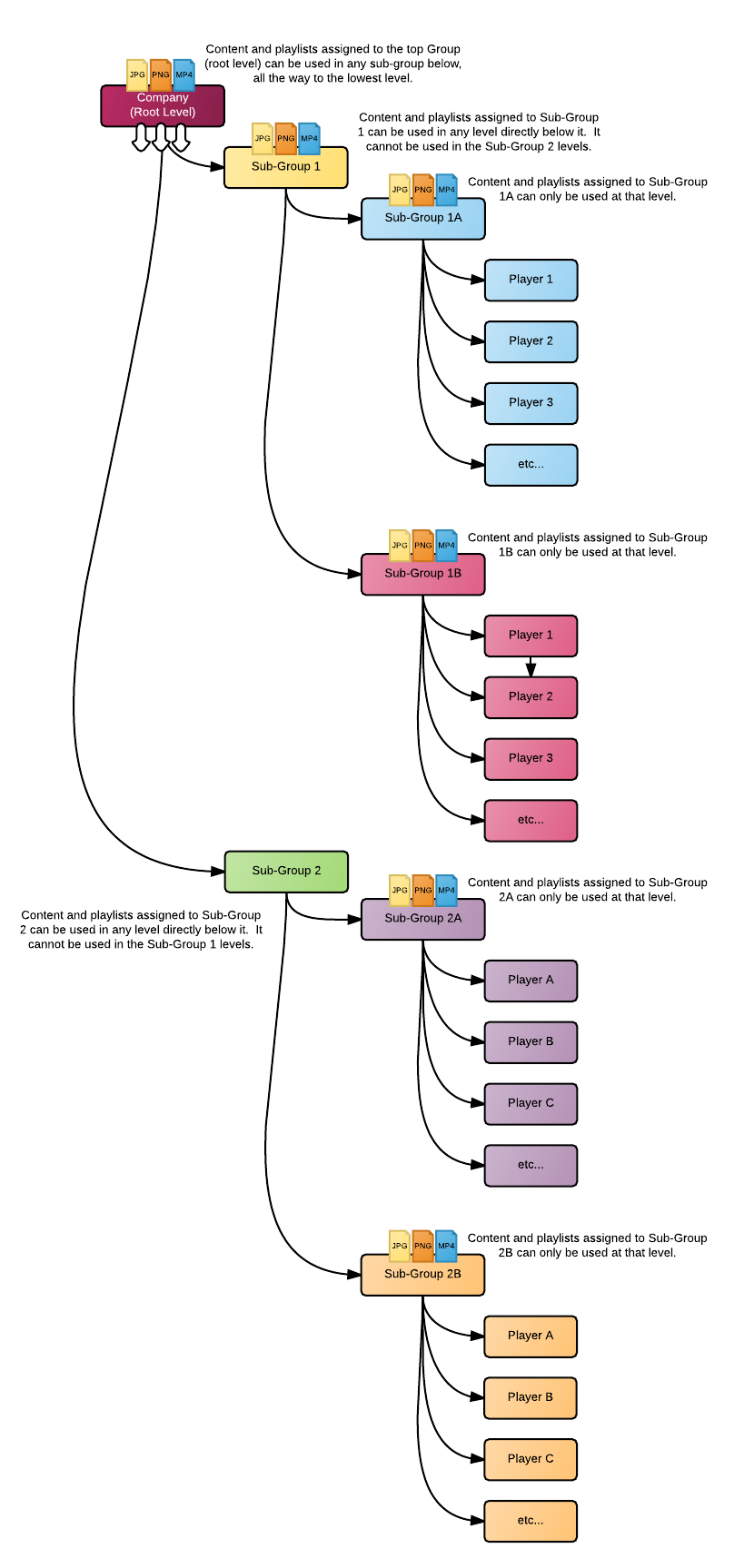
This also works in more complex networks where there are multiple levels.
In the example below, content assigned to the root level can be used anywhere. Content assigned one level below can be used in each respective lower levels. So content assigned to an intermediate group, let’s call it sub-group 1, can be used in sub-groups directly below it. However this content cannot be used in a different “branch”.
This is applies to content, templates, tickers and playlists.
The Content Library Window
Here are the main elements.
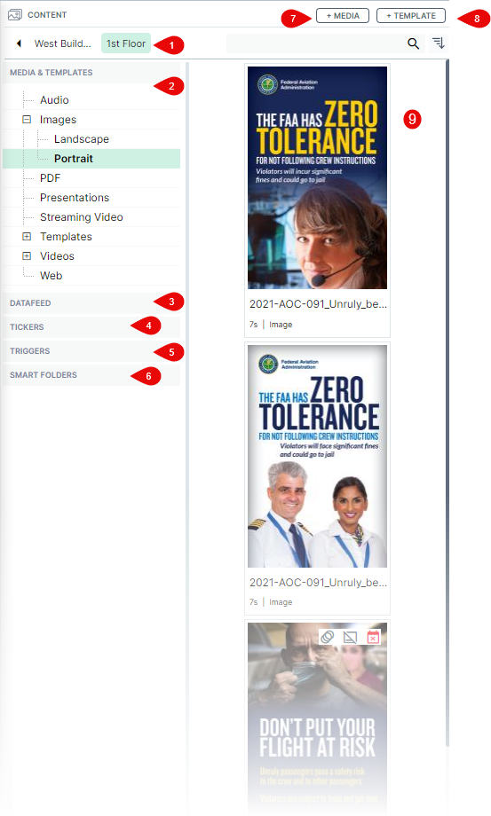
- The “breadcrumbs” are used to navigate between levels. By default, clicking on a group in the Player window will reset the other windows to the same level (content, playlist, scheduling grid). To move up the hierarchy, click on the name of the level in the breadcrumbs. If you are working in a very complex structure where there are many levels, you may need to click on the arrows at both end of the breadcrumbs to navigate up and down the levels. The Highlighted level is the currently selected one.
- The left pane under the breadcrumbs is where you will find your Media and Template tab. When you start there will only be a single folder. This folder is called: MEDIA & TEMPLATES. Consider it the root level of the group's content library. You can drop all your content in this folder or subdivide it by creating one or more folders. Note that folders can contain other folders as well.
- Under Media and Template, we find the Datafeed tab.
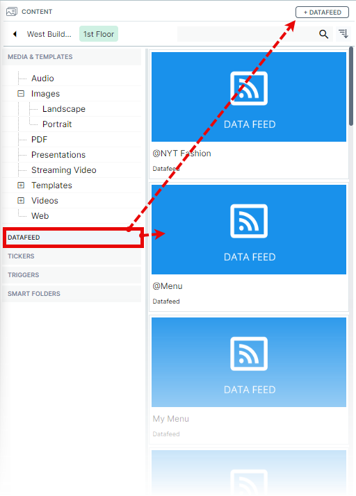
When DATAFEED is selected, the view in the right pane will change to show all your datafeeds. Also the +DATAFEED button will appear at the top of the window.
To edit an existing datafeed, simply click the Edit Properties icon when you hover on the lower right corner of the feed's thumbnail.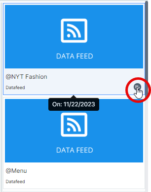
To create a new datafeed, click the +DATAFEED button.
Click here for more information about the Datafeed Manager - The Tickers section features two sub-folders: Published and Not Published. These folders are used to store any ticker you create.
When Tickers is selected, , the view in the right pane will change to show all your tickers in the selected folder. Also the +TICKERS button will appear at the top of the window.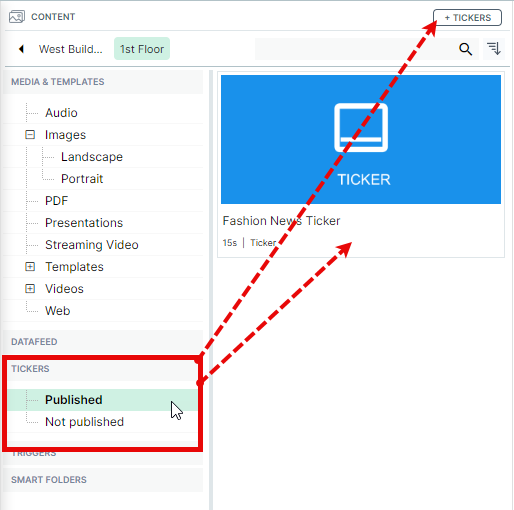
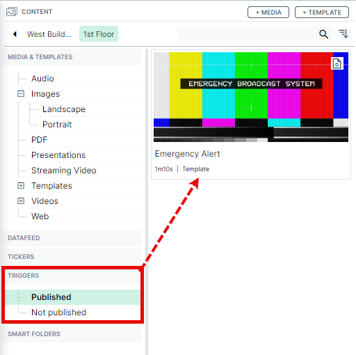
Refer to the Ticker Designer Tour for more information. - The Triggers section features two sub-folders: Published and Not Published. These folders are used to store any content you wish to trigger. Refer to Rule Based Triggering for more information.
- The section below is called Smart Folders. These folders are created by default.
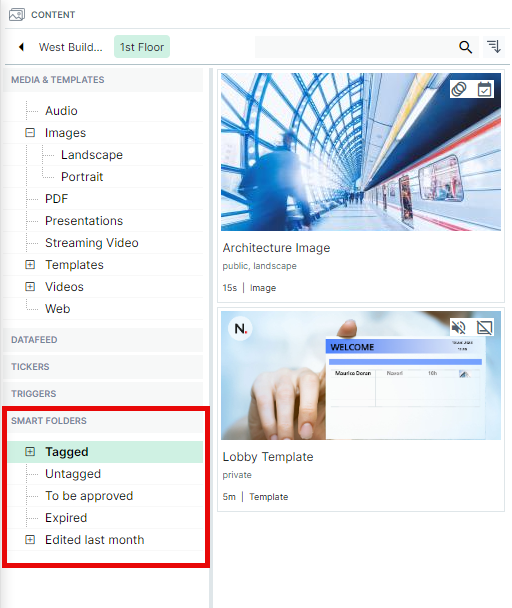
They help you quickly access your content by filtering them based on 5 criteria:
- Tagged: Each tag you create becomes a sub-folder where you can see the matching content.
- Untagged: You will find all untagged content in this folder.
- To be approved: This is for users who deploy content that requires approval before it can be published. Content waiting for approval will appear in this folder.
- Expired: All expired content will appear in this folder (see Content Validity for more information).
- Edited last month: Any content that has had its properties modified within the last month will appear in this folder. Subfolders will automatically be created for each user who has made changes to any content in the library. Click on each folder to see the content that was modified. Changing an image's duration, trimming a video's length or performing other changes to the content properties will make the content appear in these folders.
Tagged smart folder behavior
In the example below, the sub-folders under "Tagged" show content with each respective tag. The image in our example has "public" and "landscape" tags assigned so it will appear in each corresponding folder. Each time you create a new tag, you will see a corresponding sub-folder appear under Smart Folders / Tagged. Removing a tag will automatically remove the corresponding sub-folder under Tagged. Note the content doesn't go away until you delete it. These folders are only used for filterng the content in the library.
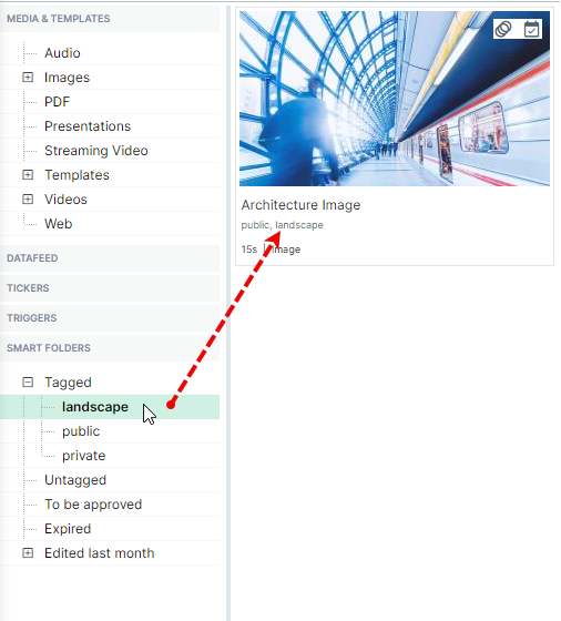
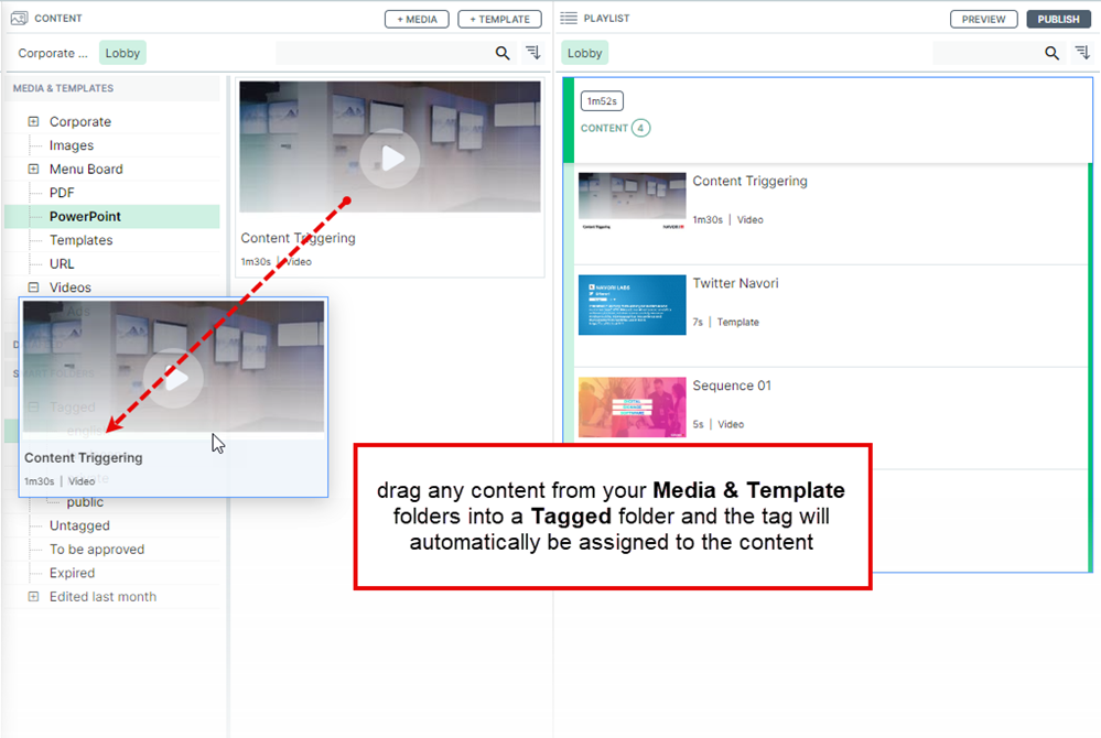
USEFUL TIP: You can toggle Smart Folders and Media & Templates folders opened or closed. This makes it easy to drag and drop content between folders. You can also use this technique for quickly tagging content. For example, dragging content from any upper folder in the library into a tagged smart folder will automatically assign the tag to the content.
- Use the +MEDIA button select the content you wish to add to the library.
Click here for more information. - Use the +TEMPLATE button to open the Template Designer.
Click here for more information. - The content library thumbnail list shows all the media in the currently selected library folder.
Additional information about the content is presented with each thumbnail.
Here is a list of all the information that you will find:
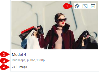
- Symbols: Transition assigned, audio muted, ticker suppressed, content validity status, conditional playback rule
- Content Name
- List of Tags assigned to the content
- Content Duration and Type